Wouldn't you totally giggle every time you opened your freezer to see a penguin staring back at you? I sure would! So, Sweet Habit is a new brand of low-calorie, high-protein ice cream and the packaging was designed by Sterling Brands. This packaging system is adorable and smart. The minimal design highlights the value and main benefit of the product: it's low-calorie content but it doesn't skimp on personality while doing so.
It's obvious that the team working on this did a market audit to understand what the strengths of the competitors, what messaging adds value for the customer and how to attract the customer's attention in this category. I thought it would be fun to take a look of some of the other healthy ice cream packaging out there.
Halo Top
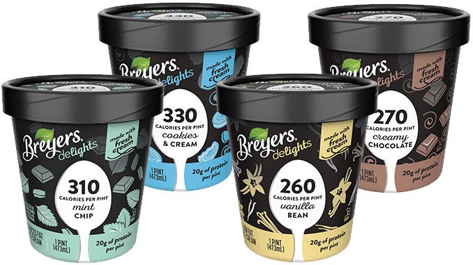
Halo Top is the original low-calorie, high protein ice cream. And it's success in the market can be traced back to the brand and packaging update they did with Peck & Company in 2015 (read all about their history and how the rebrand impacted their business here). They have a great concept driven brand, communicating to the customer that this is a "guilt-free" treat. Elements of the name, gold halo around each lid and calorie count loud and proud on the front (all coming in under 300 calories for the full pint!) support the idea that this a healthy treat you can feel great about indulging in. Their color coding echoes the elements of each flavor but is not as systematic as some of the competitors, but in this category I don't think that's a bad thing. The customer isn't necessarily confuse the chocolate with the chocolate mocha chip. They support with a couple additional features on the front of the package, but they've learned they lead with their main benefit and everything else is just the cherry on top.