Wrapping up this trip to Nashville, I’m understanding why people are saying it’s the next Vegas: it’s a lot of fun, you can stay out all day and night watching live music but after 4 days it’s time to leave! While out exploring yesterday I found some great packaging. A few of these items are local and all of them have an authentic feel. Take a look and enjoy!
Brand Brief: Why did the chicken cross the road?
To chase the millennial, of course! This morning, Perdue announced an update to their packaging, only the fourth major change to their brand design in 50 years.
OLD
NEW
With customers of all ages being more conscious of what they feeding their families the brand moved in a cleaner more friendly approach. Interestingly, Purdue notes that they are particularly trying to attract millennial customers with the "playful illustrations and vibrant colors" as well as the "trusted product attributes like no-antibiotics-ever, 100 percent vegetarian fed, no animal by-products, [and] raised cage free."
And in case you're wondering, the chicken's name is Pearl.
Read up!
Here are a couple articles that are worth checking out.
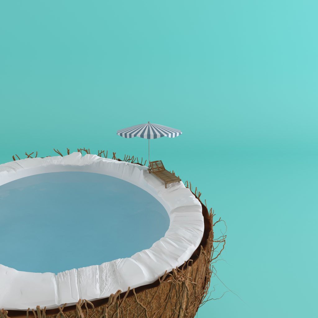
Adobe Has Released the Visual Trend of the Summer: Creative Reality
This photo sums up this article better than I ever could in words.
What Designers Want Copy Writers to Know from HOWDesign.com
This is really more of a how designers and copywriters can partner together for great results article.
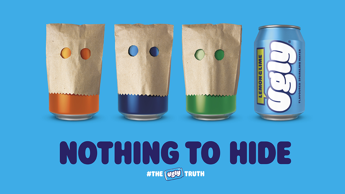
AIGA Eye on Design has a great deep dive into branding water. A really great explore of the different directions you can take a brand within the same category. It all comes down to positioning.
Rachel Cook, senior account manager at Thompson, points out that the major challenge for a water design project is that “water is just the same to some people—there’s no product differentiation, it really is the same. Unlike other categories like crisps, which can be differentiated by bringing in new flavors, or cues around crunch—water brands can only differentiate their product through the brand.”
Have you read anything lately we should check out?


