With this holiday weekend starting, I've got all things warm weather on the brain. And what treat makes a hot day better? Ice cream of course!
I spotted this new packaging design for Sweet Habit on the Dieline earlier this week:
Sweet Habit designed by Sterling Brands
Wouldn't you totally giggle every time you opened your freezer to see a penguin staring back at you? I sure would! So, Sweet Habit is a new brand of low-calorie, high-protein ice cream and the packaging was designed by Sterling Brands. This packaging system is adorable and smart. The minimal design highlights the value and main benefit of the product: it's low-calorie content but it doesn't skimp on personality while doing so.
It's obvious that the team working on this did a market audit to understand what the strengths of the competitors, what messaging adds value for the customer and how to attract the customer's attention in this category. I thought it would be fun to take a look of some of the other healthy ice cream packaging out there.
Halo Top
Halo Top is the original low-calorie, high protein ice cream. And it's success in the market can be traced back to the brand and packaging update they did with Peck & Company in 2015 (read all about their history and how the rebrand impacted their business here). They have a great concept driven brand, communicating to the customer that this is a "guilt-free" treat. Elements of the name, gold halo around each lid and calorie count loud and proud on the front (all coming in under 300 calories for the full pint!) support the idea that this a healthy treat you can feel great about indulging in. Their color coding echoes the elements of each flavor but is not as systematic as some of the competitors, but in this category I don't think that's a bad thing. The customer isn't necessarily confuse the chocolate with the chocolate mocha chip. They support with a couple additional features on the front of the package, but they've learned they lead with their main benefit and everything else is just the cherry on top.
Hallo Top designed by Peck and Company
Arctic Zero
This brand is double trouble, they have frozen dessert and a light ice cream on the shelf. As customer I would be asking what's the difference? The frozen dessert is their original and is dairy free. The light ice cream is a new offering that launched a couple of months ago. The ice cream has a new, modern logo which also feels a bit playful with the lower case type and asterisk dotting the "i". They've chosen to lean heavy into color coding their flavors in primary like colors. The calorie content is not as front and center as Halo Top, but I'm guessing that is because only one of the flavors comes in under 300 calories per pint — they wouldn't win for the customer comparing calorie count.
Arctic Zero
Arctic Zero Non-Dairy
Breyers
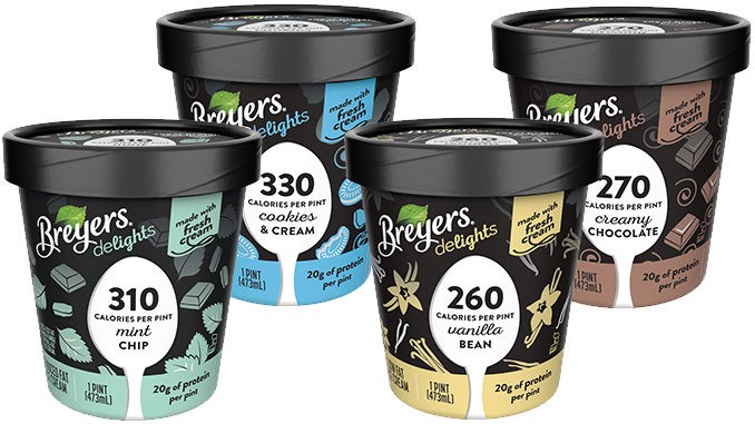
Even the big names are trying to get in on this trend! Breyer's pairs the equity in their brand with the successful approach of showing that calorie content front and center. The color coding is clean and systematic with the bar at the bottom and ingridient illustations all over the package.
Ben & Jerry's Moo-phoria
I'm not sure I've ever picked up a pint of Ben & Jerry's and bothered to look at the nutrition panel, because let's face it you always eat more than a serving and you don't want to feel guilty about that. Ben & Jerry's kept their traditional brand blue and playful nature for their Moo-phoria line. And that name is fun! Like everyone else they've got that calorie count front and center. Their unique take includes a scoop of the ice cream on the front, which is typical in full-calorie ice cream packaging, this is the only brand to include this element in the health-ish ice cream arena. And it works for them, it shows you that they haven't skimped on the extreme flavors you've come to expect from Ben & Jerry's.
Ben & Jerry's Moo-phoria
Yasso
Launched earlier this year with packaging designed by Fortnight Collective, Yasso Frozen Greek Yogurt is hitting all the right design cues. Yes, their calorie count is front, center and easy read. What I love about this concept is the ice cream. Yasso is showing you how yummy and real their ice cream is by using photos of the ice cream as the background. This idea is furthered by the flavor name being knocked out to the photo and "drips" of ice cream running into the color blocking. And about that color blocking, the system relies heavily on color coding, but I wonder how many more colors could be added if they expand the line? Again we're seeing some witty flavor names but they feel a little forced (mint champion chip, anyone?). The concept of showing the real ice cream is so strong they could have gone with straight-forward, descriptive flavor names. But all in all, this one looks particularly appetizing so I'm sure I'll be trying it soon.
Yasso designed by Fortnight Collective
And if for some reason you have trouble picking one to try (really?) here's a great article ranking them.
Have a great Memorial Day Weekend!


